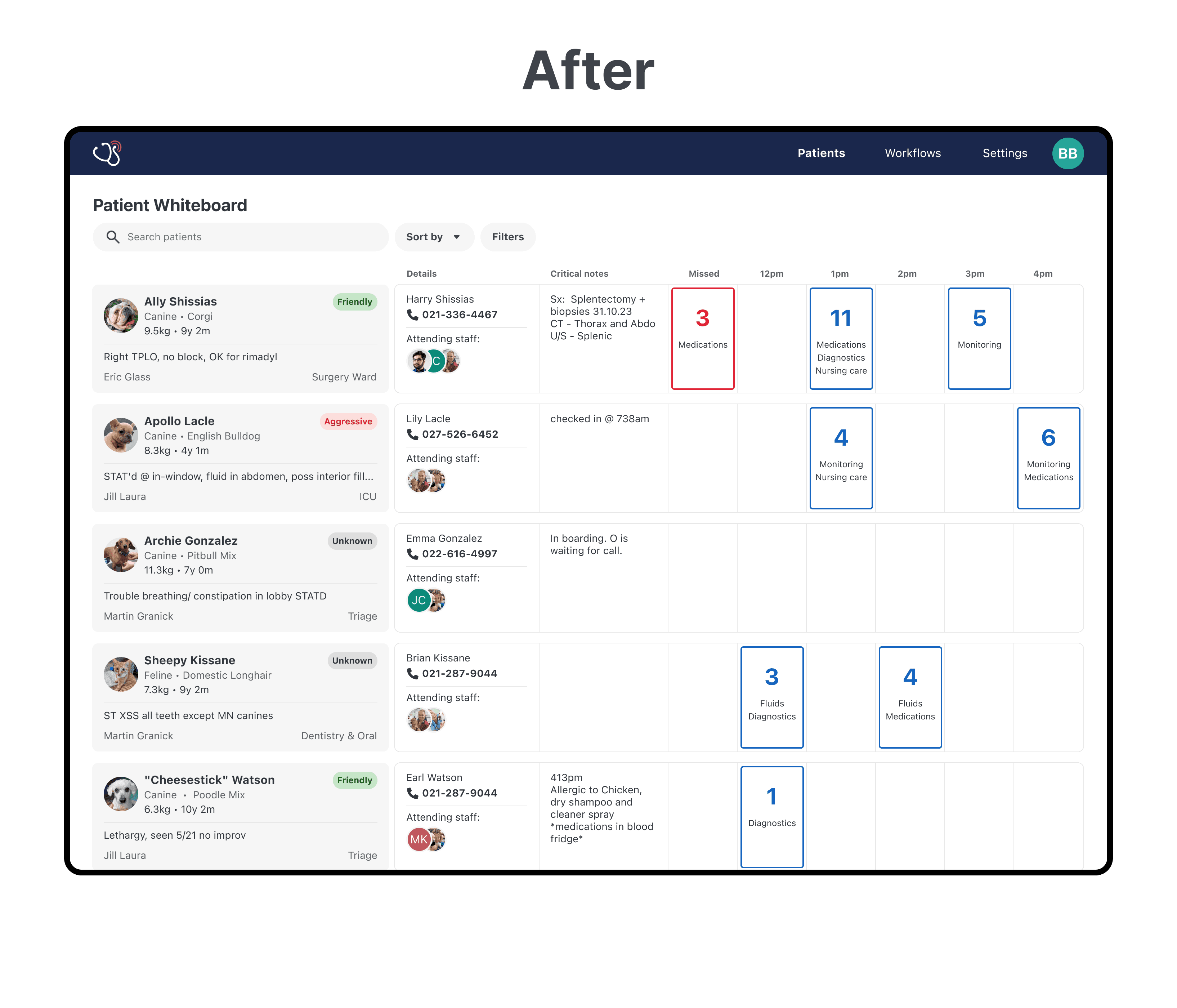
Vet Radar is a B2B SaaS designed for veterinary practitioners to manage and treat patients’ end-to-end journey in the hospital.
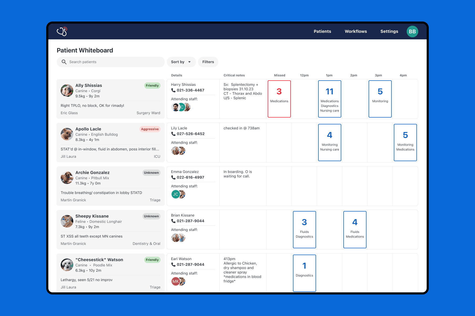
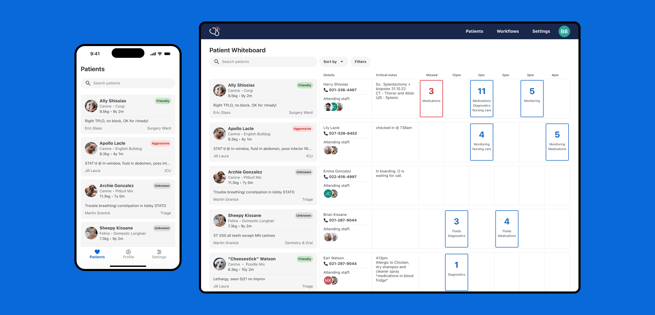
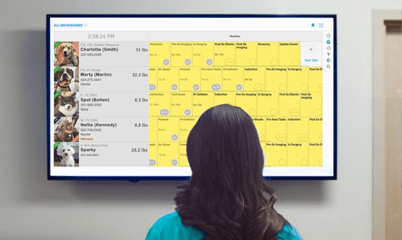
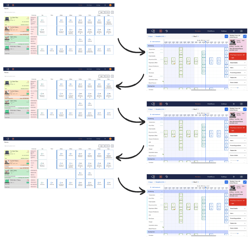
There are two important use cases to know for this case study. Firstly, Vet Radar is a patient's treatment plan, from scheduled treatments such as TPRs and medications. Secondly, Vet Radar is a whiteboard showing all in-hospital patients.
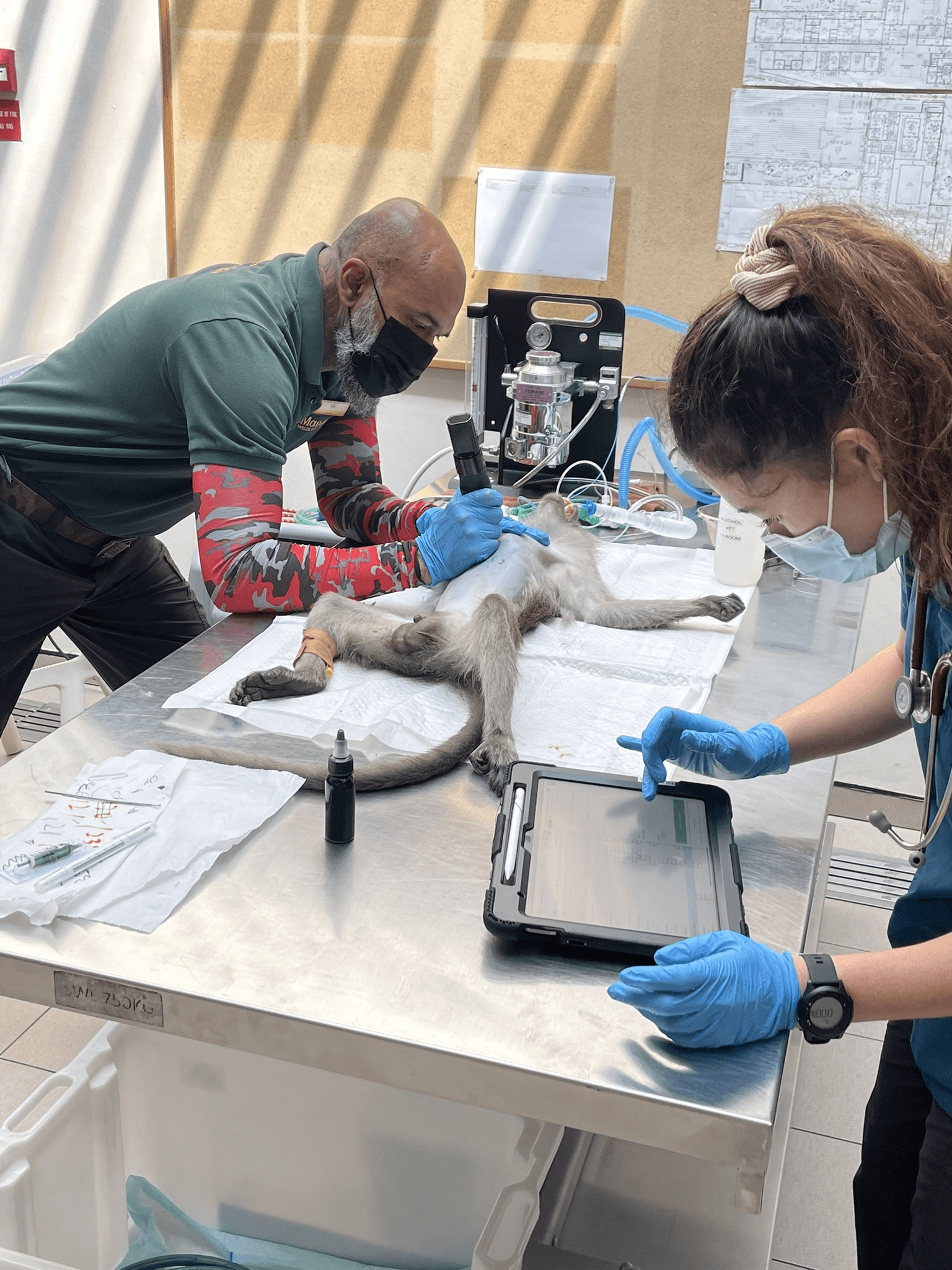
Nurse checking off a scheduled treatment via Vet Radar on iPad
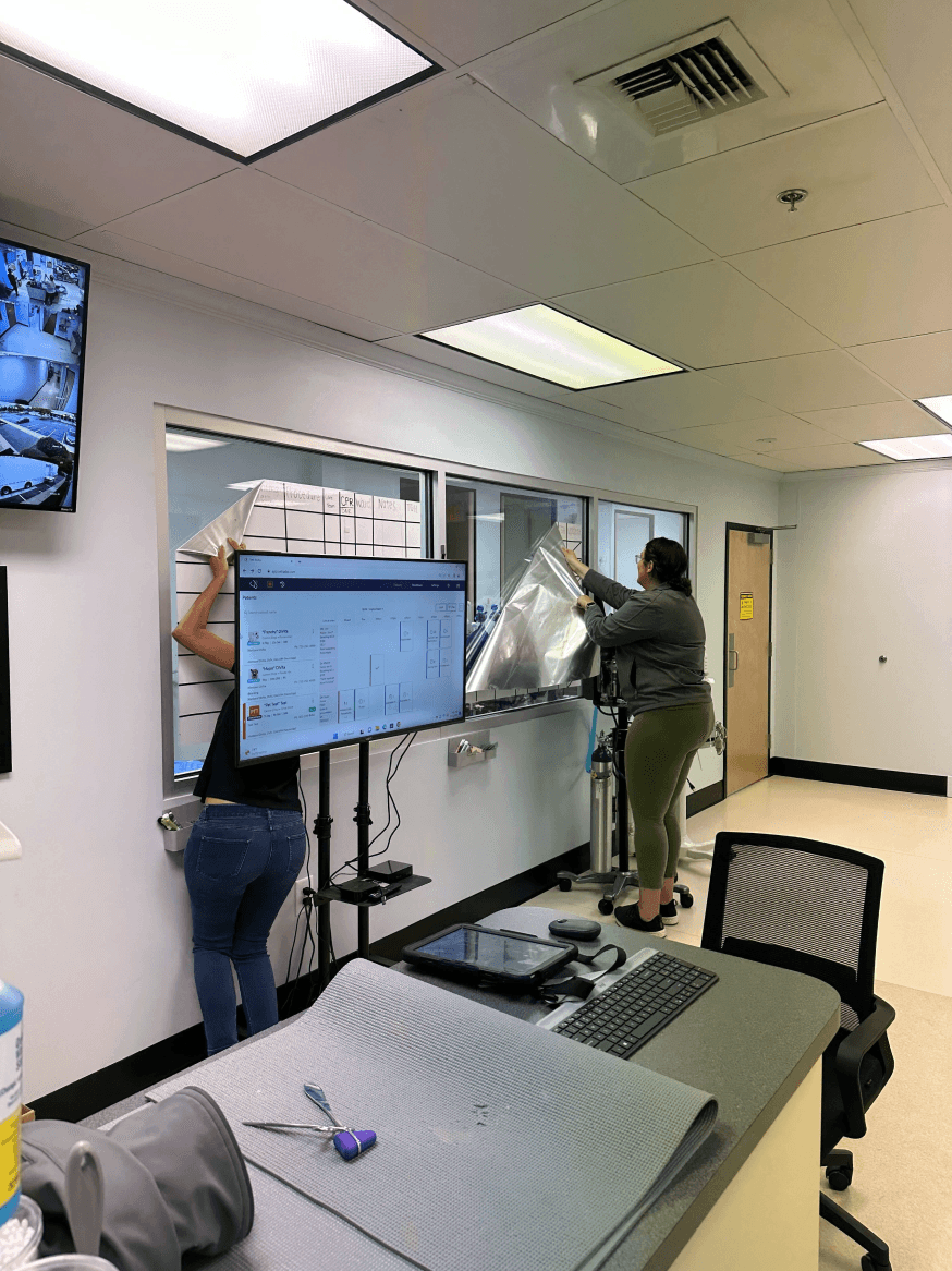
Staff replacing traditional Whiteboard with Vet Radar on TV
22% annualized churn
The biggest business problem Vet Radar faced was it had a very high churn rate. It was a multi-faceted problem costing the business a lot, as we were generating $400K in MRR.
-25 NPS
Usability is core to a product like Vet Radar. The use cases are so hands-on and vet practices get pretty intense and fast-paced, so the software needs to be fluid.
Unfortunately, our NPS reveals that the product is not meeting our customer’s expectations.
19% sales winrate
Vet Radar’s usability problems hurt its reputation with prospective customers and incur lost sales.
Many customers we upsell Vet Radar to either turn to a competitor or stick with paper.
60% of our NPS comments mention usability.
“So many clicks and pages to do things, not user-friendly at all”
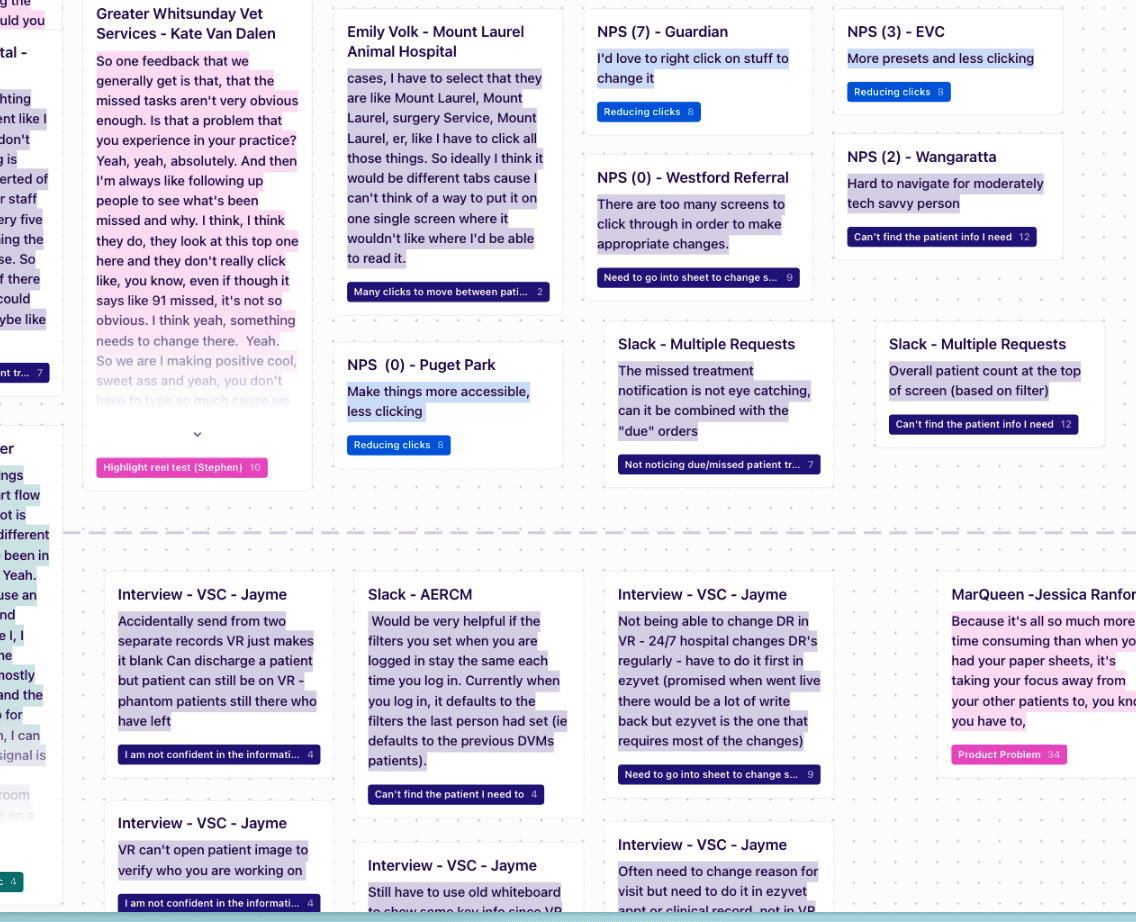
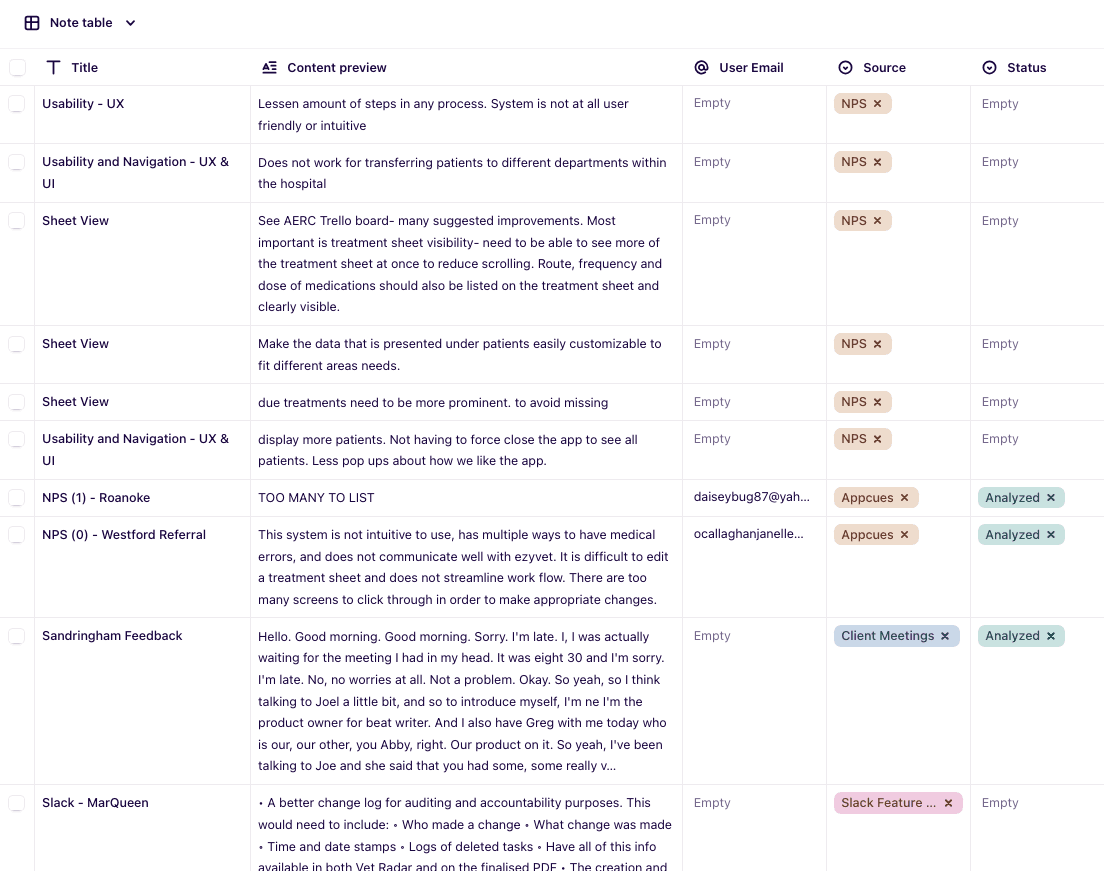
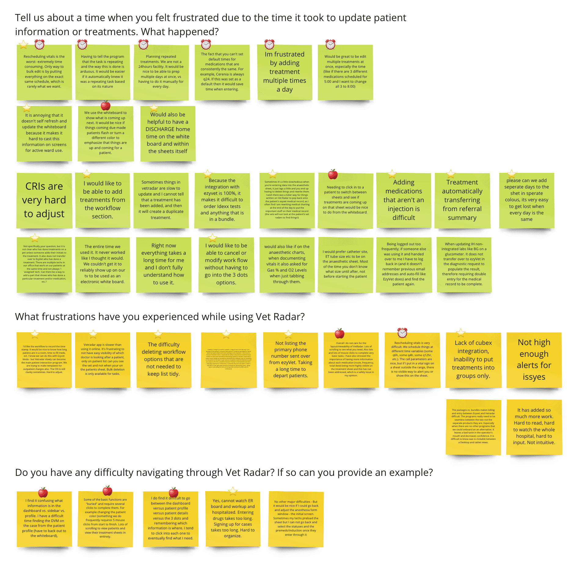
We often talk to our customers and use Dovetail to document and syntheize our research. We noticed a trend where users voice ambiguous problems around the software taking too many steps to do things and difficult to navigate around.
Veterinary clinicians face immense pressure and stress amidst an industry facing burnout and global staff shortages. Vet Radar has an amazing opportunity to help, yet the app is not meeting customer's expectations.
Example screenshots of our Dovetail research
Quant data
1. Short treatment sheet sessions
50% of treatment sheet sessions are spent with 5 seconds, and have 3 or fewer clicks.
The way I interpreted this was that if 50% of treatment sheet sessions have only 3 clicks or less, the quality of that session isn't high. HMW surface this information earlier on the whiteboard?
2. Short whiteboard sessions
Whiteboard sessions were not very long either, with 30% of whiteboard sessions are spent with < 5 seconds. This indicates to me that a large amount of time they navigate to the whiteboard solely to find the next patient to nagivate to.
3. Most common actions
Utilizing Datadog, quantitative data helped fully validate exactly what were the most common actions being performed on the patient sheet. Unsurprisingly, competing tasks is the most common by far.
Survey
1. 70% refer to due treatments very often
And despite this, we do not show the exact due treatments or active medications anywhere on the whiteboard.
2. Users were asking for a lot
Users were saying that a lot of information needed to be displayed on the whiteboard, which I questioned. The most important missing information was attending staff and due treatments.
3. Numerous other pain points
We also got a lot more insights and learned about more pain points users were specifically having with Vet Radar's whiteboard.
For example, the missed status was very easy to miss despite how important it is.
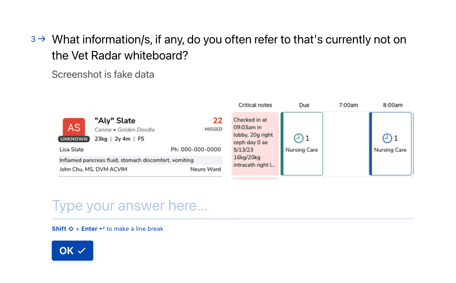
Appcues
We put out an in-app questionnaire to a segment of our 20K users.
1. 38% Finding information
38% of responses said they were solely looking for information not displayed on the whiteboard
2. Due treatments
The vast majority of respondents who were finding information were checking for the exact due treatments that were due.
Watching the session recordings matched with their statements.
3. Completing treatments
The most common action users were doing was completing due treatments.
This validates that users are both looking for information and completing actions when going to the treatment sheet.
Online forums
Through social media, we studied and analyzed a collection of physical whiteboards.
1. Main JTBD
The whiteboard's purpose is to quickly explain why the pet is here, what's happening in the room, and what priorities can be helped with.
2. All mostly the same
Contrary to what we learned through the survey, in reality most physical whiteboards show the same columns of information.
3. Attending staff missing
Researching physical whiteboards once again validated to use that the attending staff not showing on the whiteboard is a big problem.
Vet Radar's whiteboard today
Researched physical whiteboards
Competitive analysis
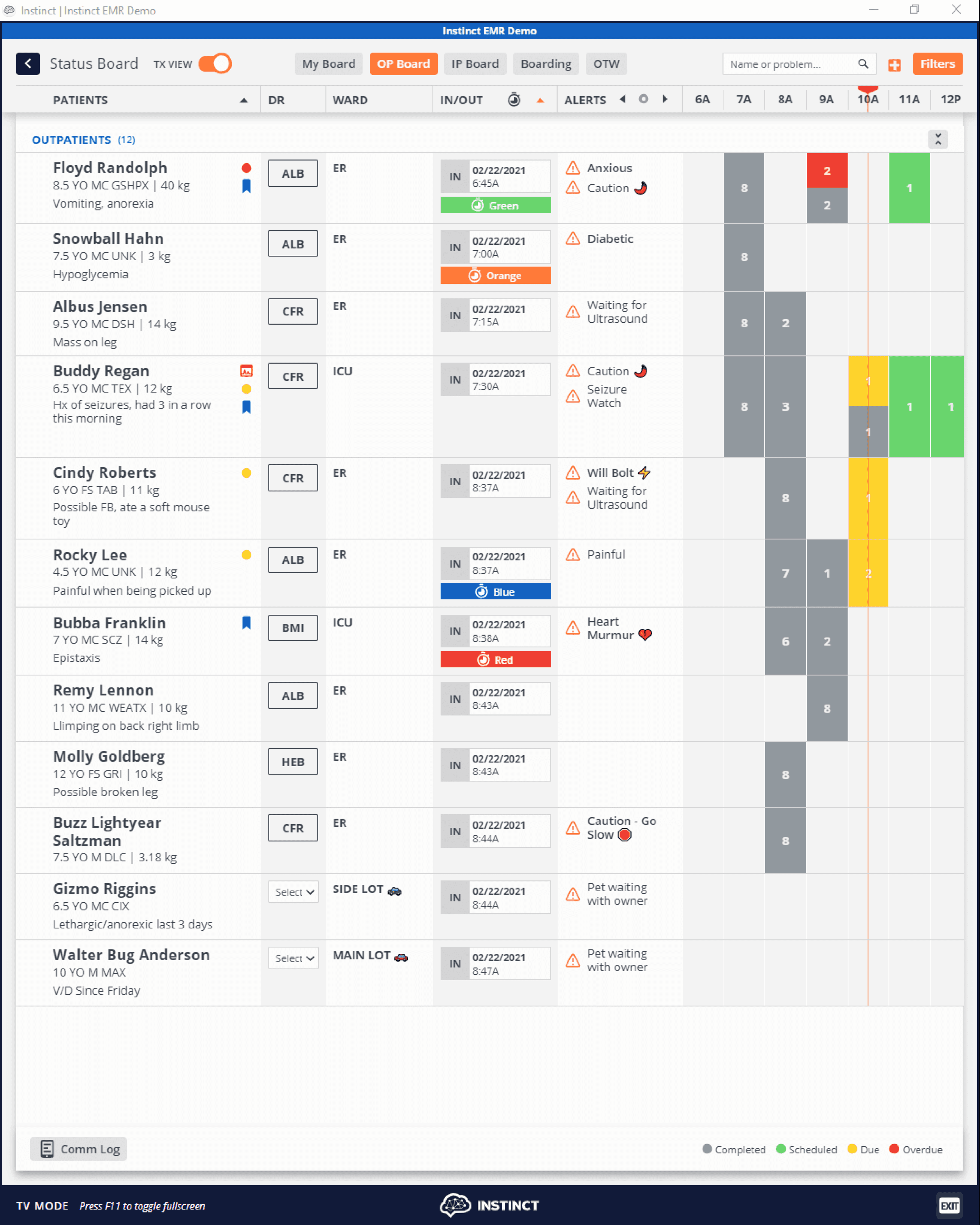
1. Instinct
Our greatest competitor by far, Insintct has a powerful whiteboard. It's interactive and displays a lot more information.
They solve the limited space problem with a toggle, where users can toggle between two different sets of information.
2. Smartflow
Smartflow allows full customization, where users can replace certain whiteboard information with something else.
While it solves the problem of limited spaces, complex customization should be avoided if possible.
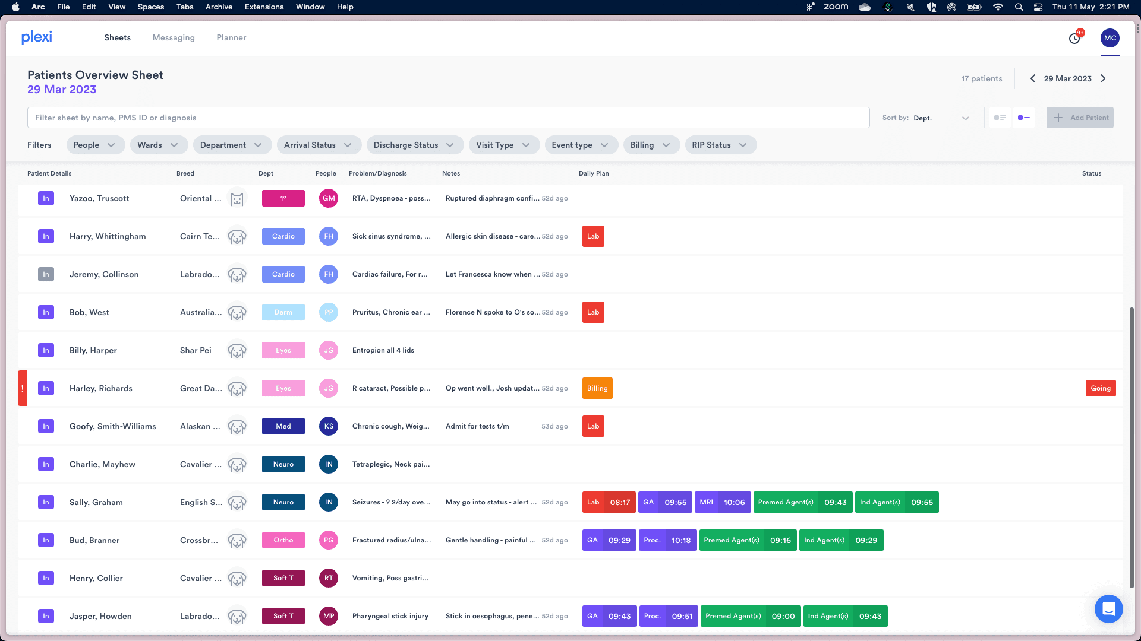
3. Plexi
Plexi elegantly solves the problem by utilizes two different whiteboard views: One that maximizes the # of patients shown, and one that shows maximum information for a single patient.
Clinicians often juggle between multiple patients. Vet Radar requires excessive clicking back and forth between the whiteboard and patient treatment plans across multiple patients. This becomes a tedious and jarring experience.
🤬 Tedious and jarring experience going back and forth between multiple patients
Example use cases
1. Shift handover
User group: Nurses & Veterinarians
"When I take over a shift from another nurse, I would need to click into the treatment sheet of each patient that is mine, assign me as the attending nurse, and click out on the whiteboard. This takes so much time."
2. Prioritizing tasks
User group: Nurses
Clinicians would click into each of their patients to skim through their treatment plan as a way to help prioritize the most important tasks to do next. This took a long time to do, and some nurses had a notebook next to them to write it down and not forget.
3. Updating the pet owner
User group: Receptionists & Practice managers
When the pet owner calls up the receptionist for an update on their animal, the receptionist would need to find the attending nurse for the patient and get an update from the attending nurse.
Unfortunately, the attending nurse isn't on the whiteboard so it's not easily glanceable from the TV.
Problem statement
Clinicians are understaffed and busy. Vet Radar requires excessive steps navigating between the whiteboard and multiple patient’s treatment plans.
For customers, this means wasted time and increased stress. For the business, this contributes to a negative NPS and a high churn rate.
Success measure
Leading indicator: Reduce time to common workflows by 50%
Lagging indicator: Reduce churn by XX%
Qualitative feedback (We stopped measuring NPS due to backlash)
Early wireframe prototype of a reimagined whiteboard
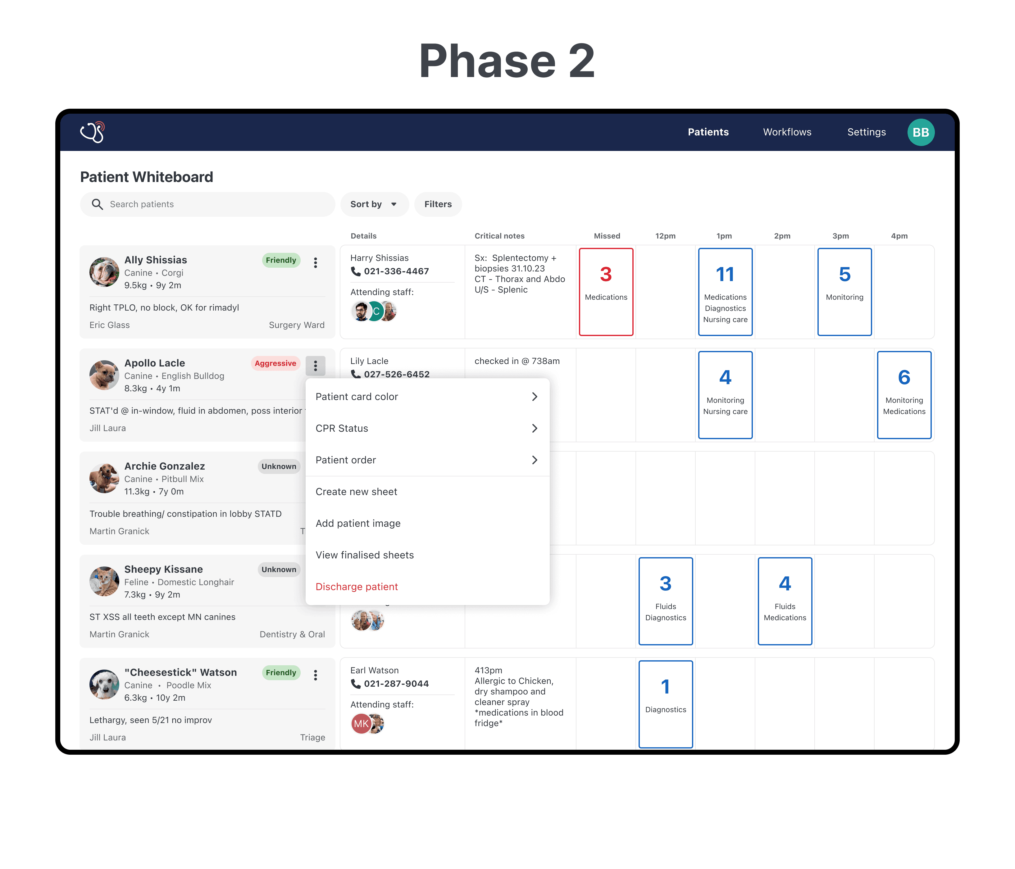
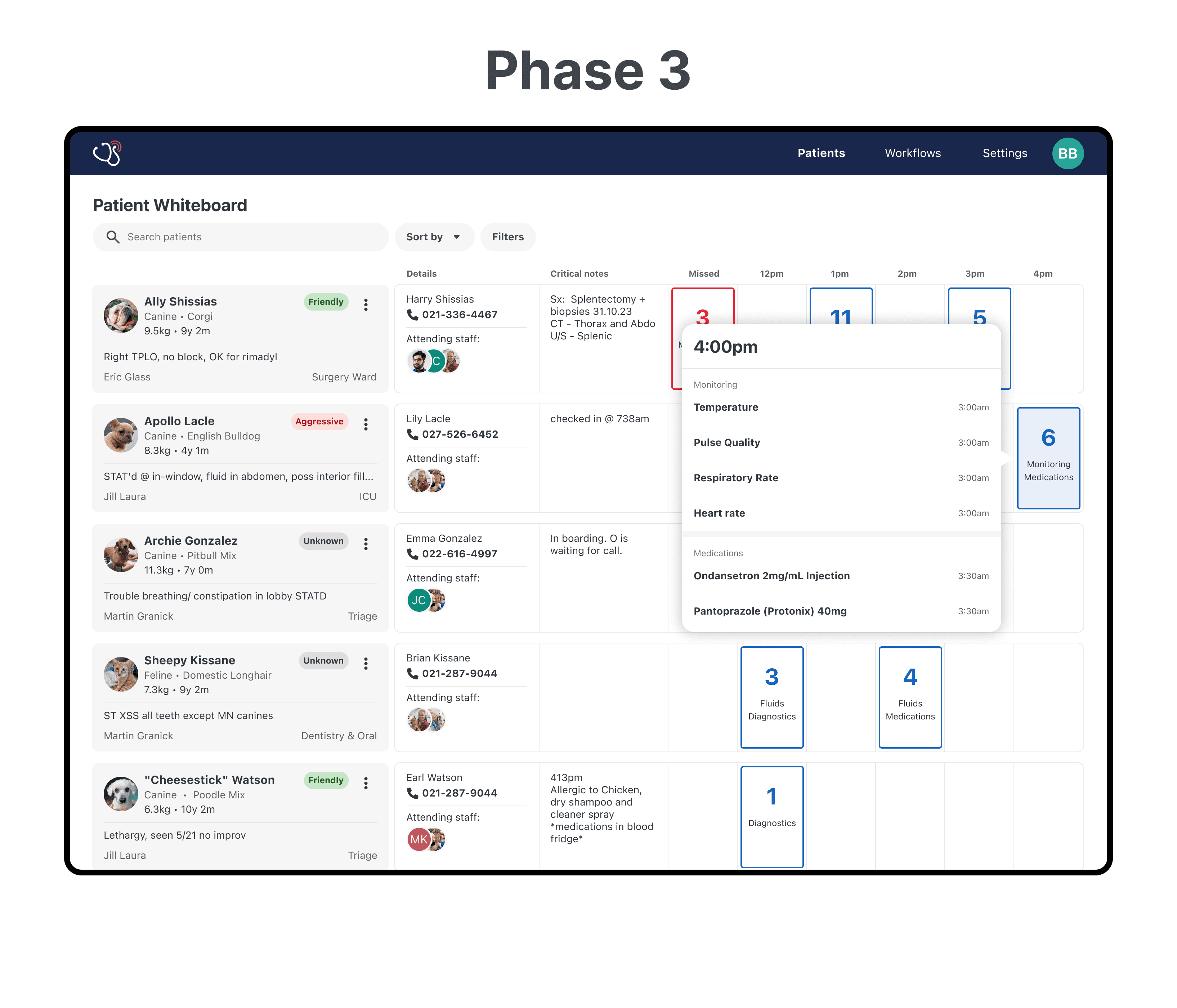
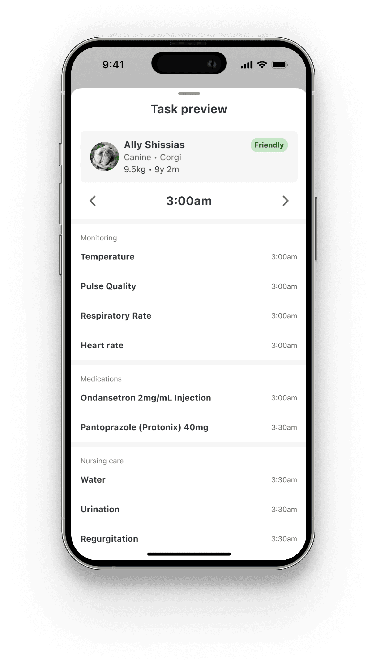
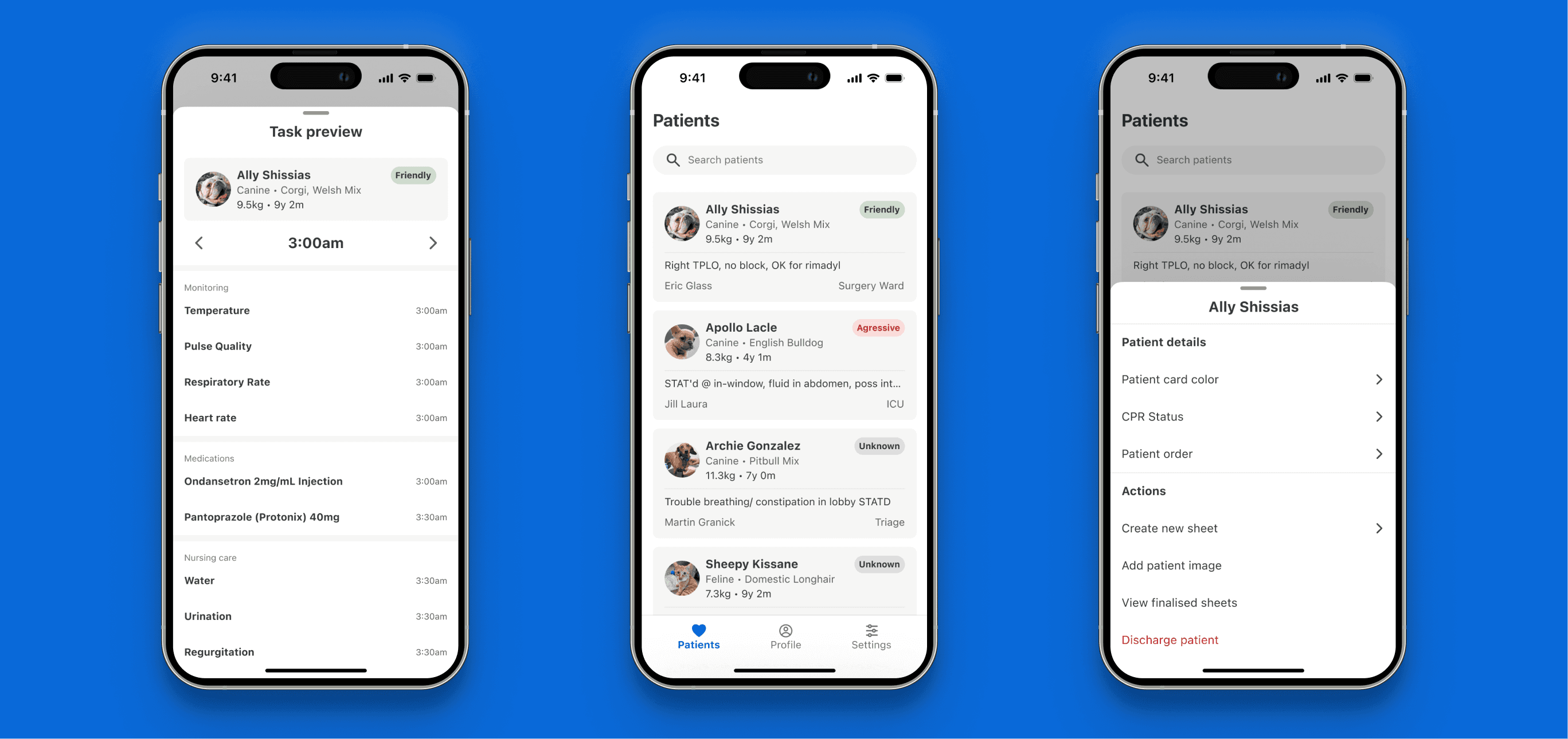
With confidence in our problem and hypothesis, I increased the fidelity of the prototype into several features for whiteboard improvements.
We tested these prototypes with customers via moderated online calls (n=10: 4 GP, 4 Emergency, 1 Oncology, 1 Exotic).
Here are key learnings from testing with customers.
1. High confidence from concept testing
Most the features tested were postive by customers. They shared concrete examples on how these features will result in massive time saving.
2. Task preview better for emergency clinics than GP
One particular feature I expected would do really well, didn't make an impact to GPs due to the predictiability of their day.
Emergency practices who live in ambiguity, on the other hand, saw immense value in this feature.
3. Big whiteboard pain points still unsolved
One of the biggest pieces of feedback on the whiteboard is that there isn't enough patients showing on the screen at once, especially when it's a static status board on hanging on the TV.
If you want to see the final outcome, an in-depth look at the solutions and design considerations, challenges, and business impact, please reach out and I can present everything in a slide deck format. 🙂
Stephenzhang112@gmail.com
https://www.linkedin.com/in/stephen-zhang1/

